 Image 1 of 10

 Image 2 of 10

 Image 3 of 10

 Image 4 of 10

 Image 5 of 10

 Image 6 of 10

 Image 7 of 10

 Image 8 of 10

 Image 9 of 10

 Image 10 of 10


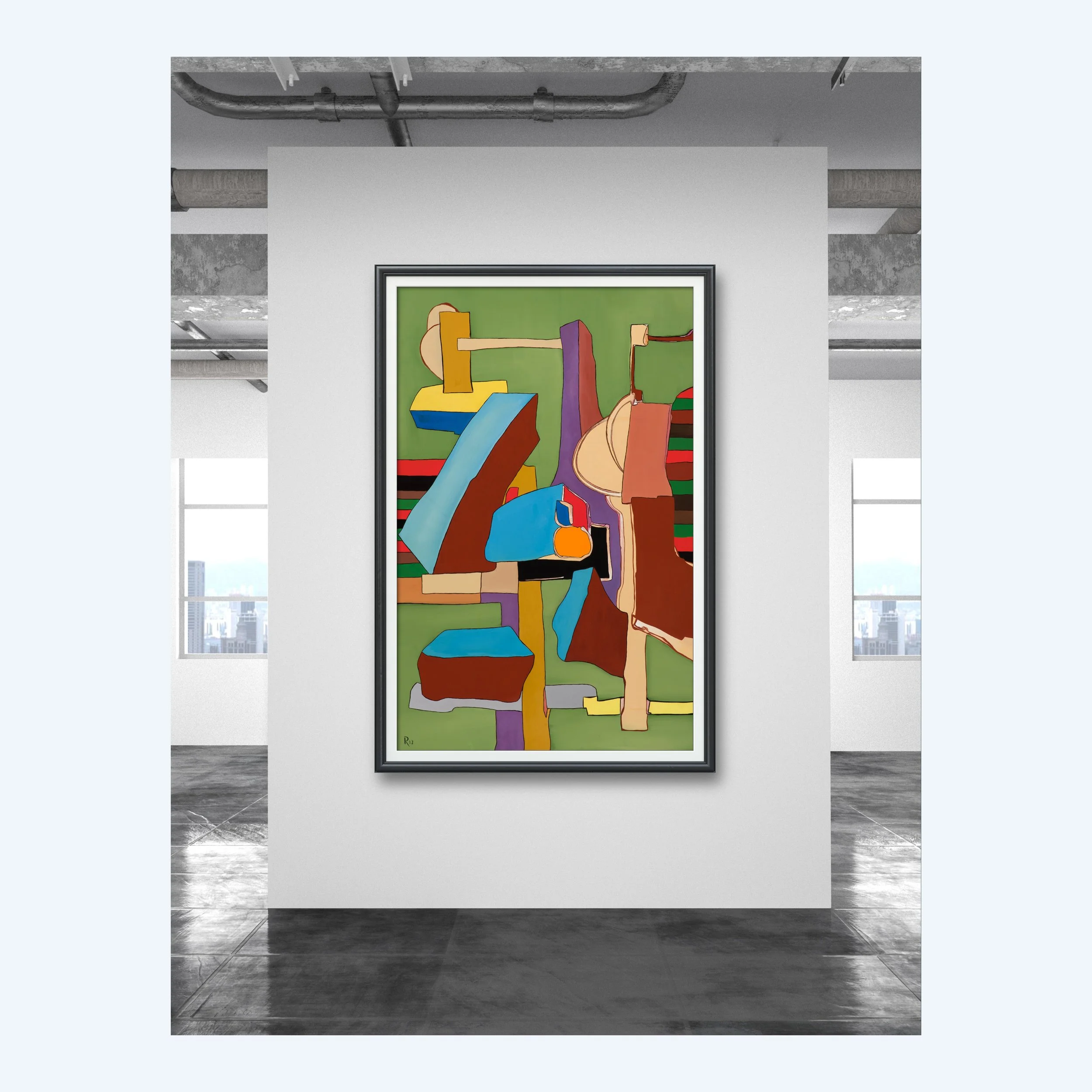
"Still Life with Duck and Vase"
102 cm wide x 152 cm tall
Oil on Canvas
PROVENANCE: On hand at artist’s studio. Signed R13 on front bottom left. Artists seal and Certificate of Authenticity in Sleeve on back. See Description below for more
102 cm wide x 152 cm tall
Oil on Canvas
PROVENANCE: On hand at artist’s studio. Signed R13 on front bottom left. Artists seal and Certificate of Authenticity in Sleeve on back. See Description below for more
102 cm wide x 152 cm tall
Oil on Canvas
PROVENANCE: On hand at artist’s studio. Signed R13 on front bottom left. Artists seal and Certificate of Authenticity in Sleeve on back. See Description below for more
Semi Abstract Green and Purple
I've been obsessed with solid flat colors ever since I flipped through my first Salvador Dali art book. Always been fascinated with him and Magritte and the other post-impressionists who could create these flat spaces with oil paint.
This painting is an exercise in that obsession. Again, whenever you see green or purple in any of my artworks it's simply because I dislike those two colors. As I have collected vintage paint over the years, each lot has come with greens and purples, I really didn't have a choice. I don't believe that greens and purples belong in the type of work I do.
I find them impossible to work with yet here I am working with them. This is merely an attempt to get rid of green paint and purple paint in such a manner that's pleasing, aesthetically. I completed this in my first home studio at the house I'm in now.
I had built what I call permanent stretchers on the walls of that studio. It worked, but it is very hard to describe how the canvas was pulled tight without boring you to death. The idea was to pull a canvas very tight without ruining my knuckles, hands and fingers.
When you stretch your own canvases long enough you practically ruin your hands, your fingers become eager for the income to buy quality stretched canvases. I like the personal touch of building my own canvases, and have built hundreds of them, but it sure is nice to have someone else build them or click a few buttons and they arrive at the studio.
The idea was to create a space that was flat hit three-dimensional, kind of combining the two. I like the idea of using colors that absolutely should not work together. The title is literally as random as you can get, but it works. The painting shows very well with a black and white frame and then in the morning modern setting.